Building a Perfect Design System from Zero
Organisation
Lumio
Role
Designer
Duration
4 Months
Tools & Technologies
Problem
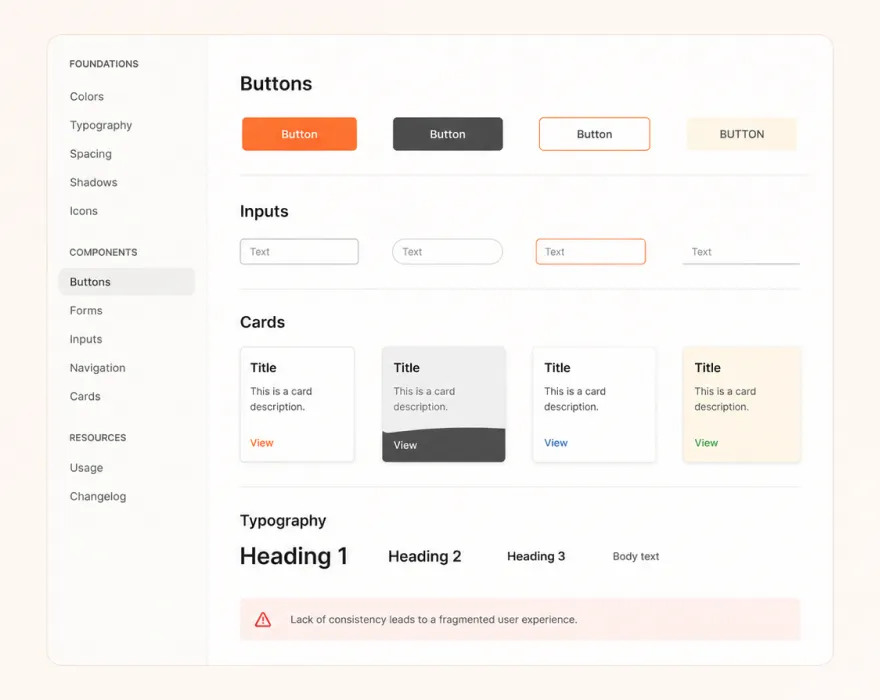
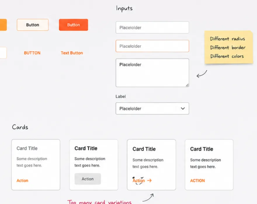
Joined the team when every screen was built in isolation - no tokens, no components, no shared language between design and engineering. Four teams shipping UI that looked like four different products.
My role
I owned the entire design-to-code pipeline. Audited every existing screen, defined the token system, built the component library in Figma and React, and got all four teams using it within a month.
Outcome
- Design system adopted by 4 product teams within 30 days of launch
How i solved it
The first thing I did was nothing.
No Figma, no components - just two weeks of pure audit. I went through every screen in the product and catalogued every button, every spacing decision, every color hardcoded differently by a different engineer on a different day.
By the end I had a spreadsheet with 340 inconsistencies across 30 screens. That document became the brief.
Then I built the token system before touching a single component. Every color, spacing value, border radius, and typography decision was defined as a Figma variable and mirrored as a CSS custom property in the codebase. The rule was simple -
If it isn't a token, it doesn't exist.
That single constraint eliminated an entire category of future inconsistency. Components came last. Each one was built simultaneously in Figma and React - so there was never a moment where the design file and the codebase diverged. Every component shipped with default, hover, focused, and disabled states. Every decision had a written reason in Notion.
The goal wasn't just to build a system - it was to build one the team could maintain without me.
What shipped
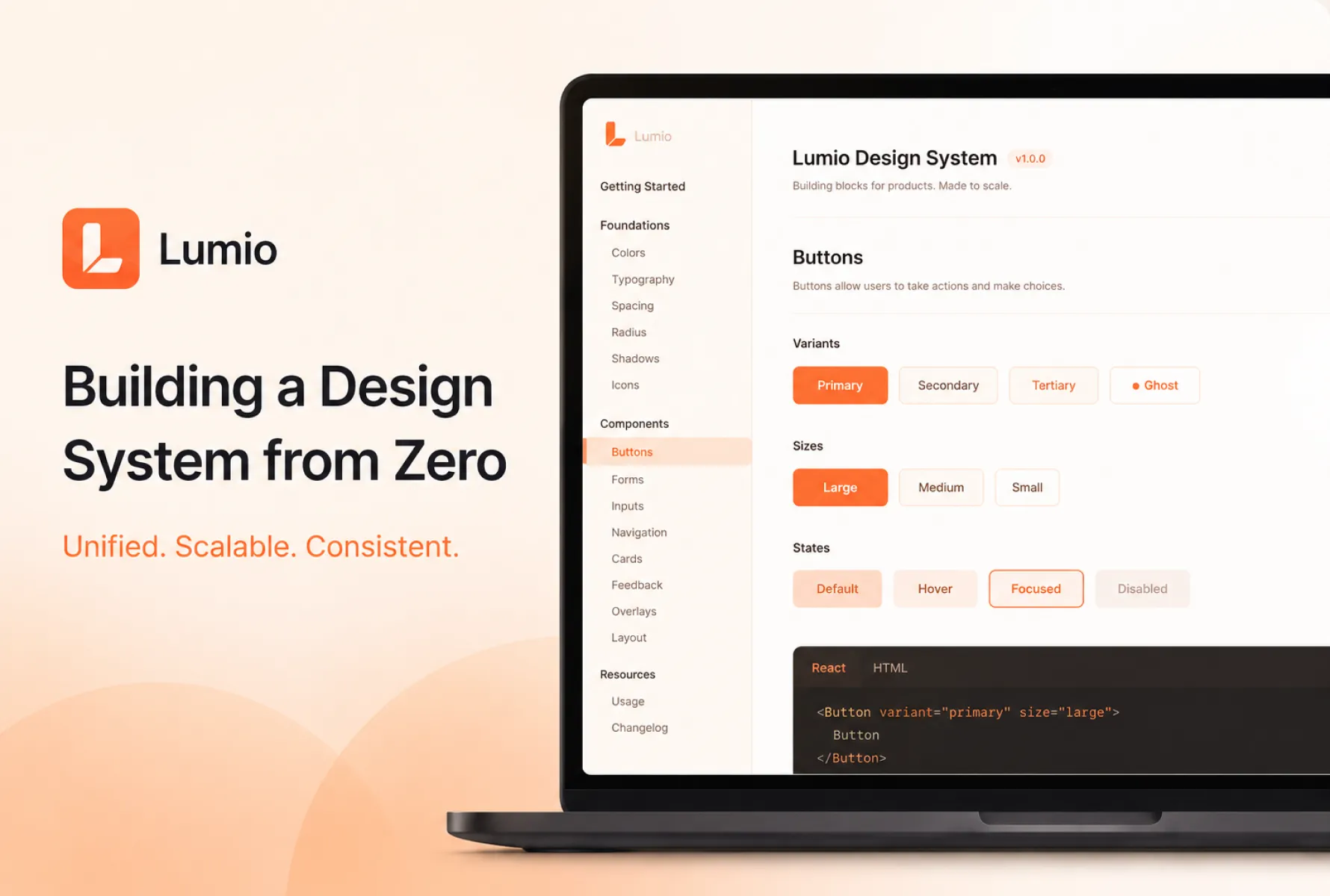
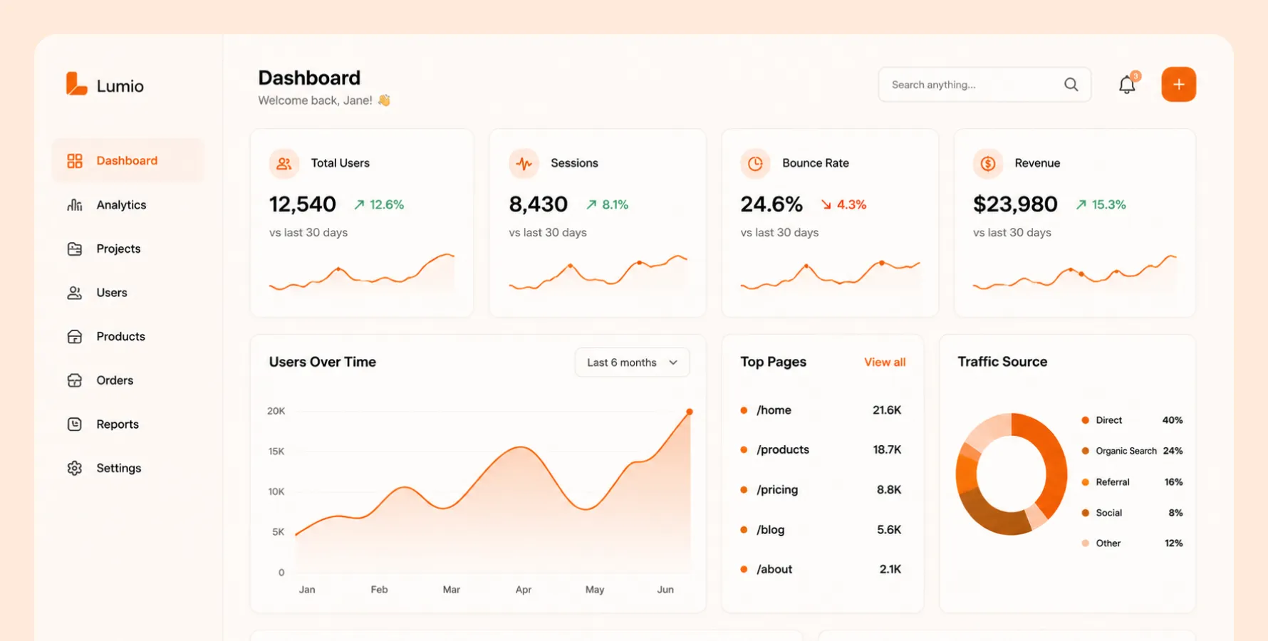
60+ components across 8 categories - forms, navigation, data display, feedback, overlays, layout, typography, and actions.
Every component was documented in Storybook with live examples, prop tables, and usage guidelines written for engineers - not designers.
The thing that made adoption fast wasn't the quality of the components — it was the documentation.
Engineers didn't have to ask questions because the answers were already there. The system went live to the first team in week 14. By week 16 all four product teams had migrated their active sprints onto the new components.
What worked
Auditing before designing saved weeks of rework. Building tokens first made everything downstream faster. Writing documentation as I built — not after — meant the team could adopt it immediately.
What I'd Do Differently
Involve engineers earlier in token naming — had to rename variables later. Ship a smaller v1 faster instead of covering every edge case before launch.
// Other works
Have a look at my other work
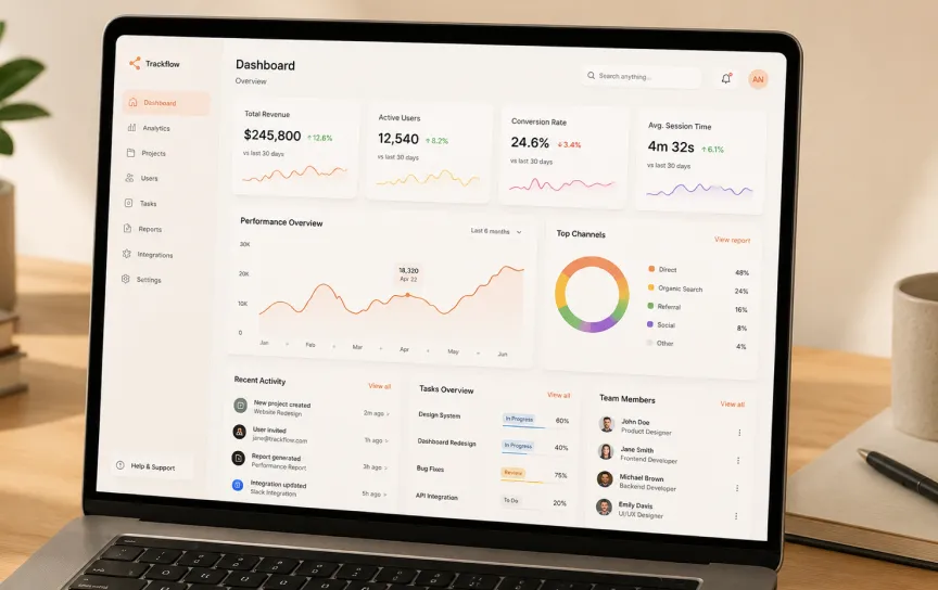
Redesigning the Core Dashboard of SaaS Product
The old dashboard had 11 years of visual debt. I stripped it back, rebuilt every component in React, and shipped a version that cut user drop-off by 40%.

Trackflow HQ
Frontend + Designer
Launching a Marketing Site in 5 Days
Startup needed a launch site before their funding announcement. I designed and built the entire thing in Framer — live in 5 days, no handoff needed.

Orion Labs
Design Engineer